More Than Stats - Creative Impact Report Design
One of my favourite design projects to work on is creating impact reports. These reports are a fantastic way to showcase an organisation’s achievements in a clear and engaging way. Using accessible designs, infographics, and eye-catching iconography, I help bring their success stories to life while making complex information easy to understand.
Here are some of my favourite examples of impact reports from my portfolio:
Oxford SU Impact Report
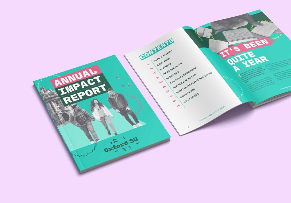
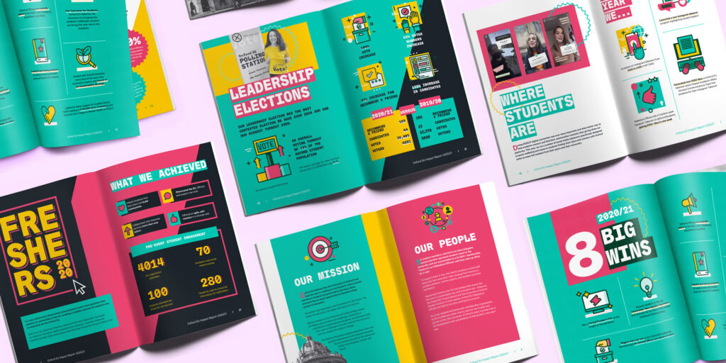
I designed the Oxford SU Impact Report to highlight the organisation’s achievements over the academic year, focusing on its support for students and key initiatives. Vibrant colours were used throughout to create an energetic and engaging feel, reflecting the dynamic nature of the SU’s work. I incorporated modern iconography to break down complex information into easily digestible visuals, helping readers quickly grasp key points.
The combination of bold typography, custom infographics, and a clean, organised layout ensured the report was both professional and approachable. The final report successfully captured the SU’s impact in a clear, professional, and visually appealing way, making it an effective tool for celebrating their accomplishments.
Bristol SU Impact Report
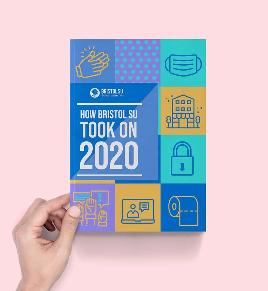
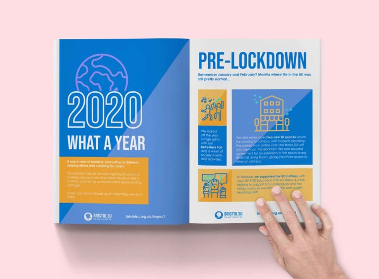
I designed the Bristol SU Annual Report for 2020 to highlight how the organisation excelled in supporting students during an especially challenging year. The design featured icons and illustrations that captured some of the unique topics of the time, such as crafting, food distribution, and even toilet roll. These playful elements added a relatable and engaging touch, helping to tell the story of the SU’s resilience and creativity in a difficult period.
In 2 Science
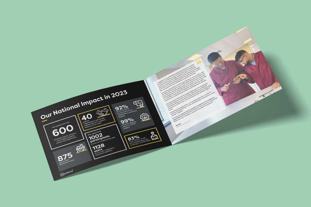
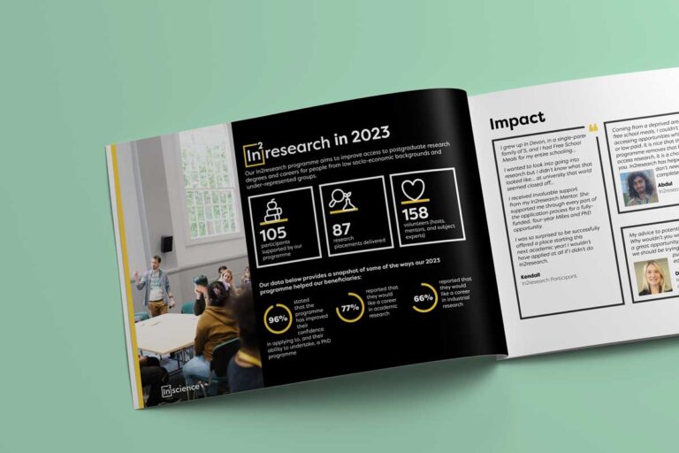
The the In2scienceUK Impact Report aimed to showcase the organisation’s efforts in promoting STEM opportunities for underrepresented students.
The report features a clean, professional layout with bold typography and colourful accents to emphasise key statistics and stories. Custom infographics and iconography were used to present data in an engaging and accessible way, reflecting the organisation’s mission and impact.
The final design effectively communicated In2scienceUK’s achievements while inspiring readers with its clear and vibrant presentation.
Chevening Annual Report
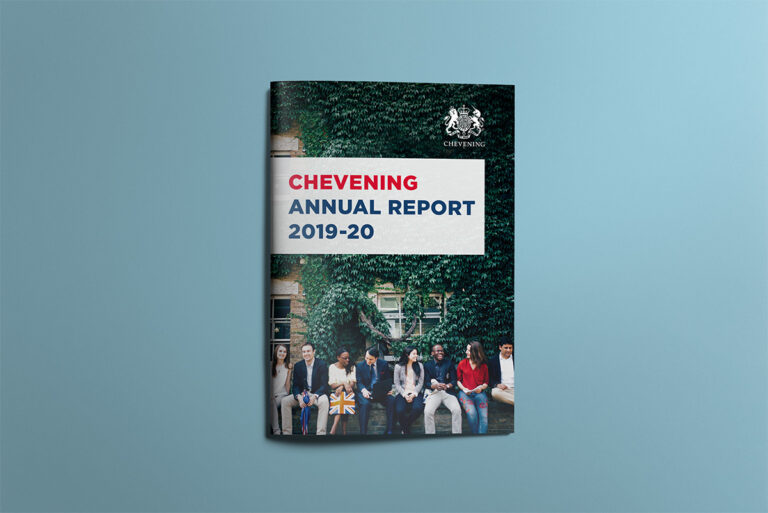
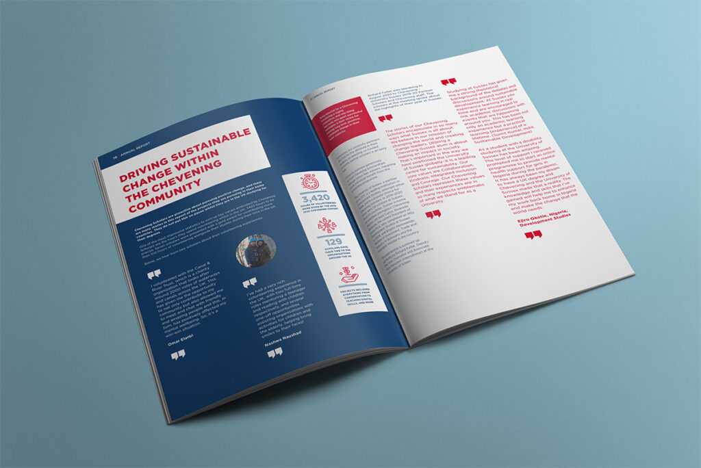
I designed the Chevening Annual Report to achieve a professional and prestigious look while ensuring it remained accessible and engaging for an international student audience. I focused on the organisation’s core brand colours—red, white, and blue—using them prominently throughout the design. To enhance the visual connection to the logo and the UK flag, I subtly edited photos to highlight these colours, creating a cohesive and polished feel. The final report balanced a professional look with an approachable feel, making it resonate with Chevening’s global community.
KSI Annual Report
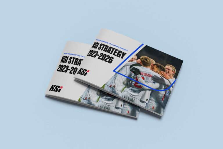
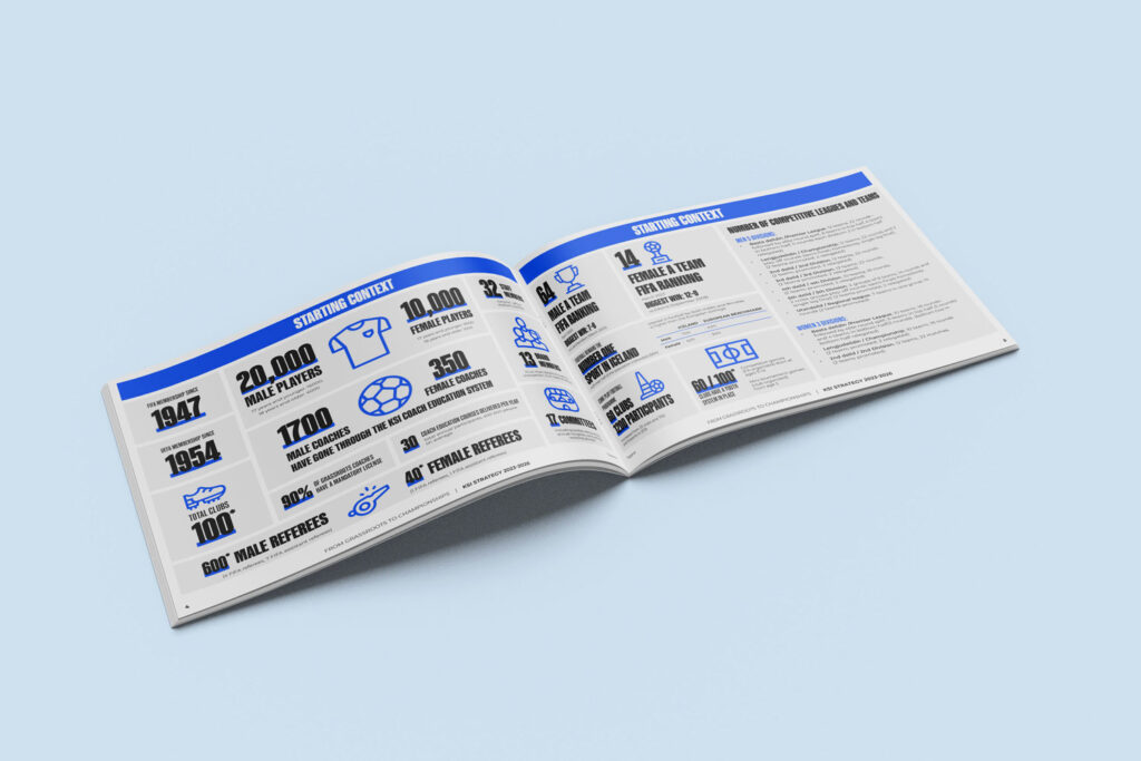
This project for the Football Association of Iceland aimed to communicate their future strategy while also highlighting the impact they had made to date.
I designed a strategic report to help a client effectively communicate their key goals and achievements. The design focused on creating a professional, easy-to-read layout that presented complex information clearly. I used a clean structure with bold typography and custom infographics to highlight important data and insights, making the report both visually engaging and informative. The final result successfully conveyed the organisation’s strategy in a way that was accessible and visually appealing.
Ready to make your impact report stand out?
As a freelance graphic designer, I can help bring your organisation’s achievements to life with engaging, professional design. Book a free 30-minute, no-obligation consultation today, and let’s discuss how we can create something great together!
