Make your third-sector graphic design more accessible with these tips for colour, font,and layout
There are around 350,000 people legally registered as sight impaired (partially sighted) and severely sight impaired (blind) in the UK alone. Whether you rely on digital campaigns or a mixture of digital and print, it’s incredibly important for charities, in particular, to make sure their content is accessible.
Charities are built upon a shared desire to help a group or cause in need, usually with the mindset that no single group or cause should be left out or forgotten about. Their content should be accessible so that they can live up to their word and ensure their services (and opportunities to donate) reach as many people as possible!

Colour
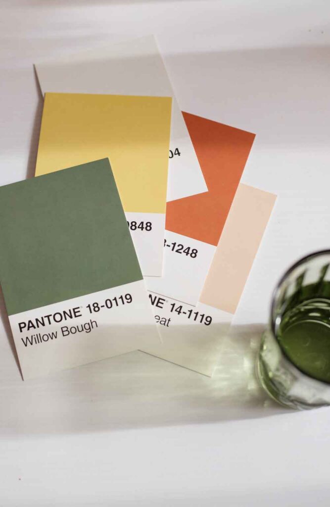
Although colour can be a beautiful way to convey information and convince people to support your third-sector organisation, it shouldn’t be your only way. People who are colour blind won’t be able to take in your campaign messages and consume the content as well as those without sight impairments. Colours with a lack of contrast are also very difficult for anyone to read, and are almost impossible for those with visual impairments.
If you’re unsure whether the colours on your campaign are accessible enough, there are colour contrast tools available such as this one from Adobe that can tell you whether your colours would pass.
Text
I love a fancy script font as much as the next designer, but unfortunately, these fonts can be hard for anyone to read, but even more so for those with visual impairments and impairments such as dyslexia. When choosing a font, make sure that it’s a font that isn’t too dense – spaced out letters are easier to read.
Check the weight of the type, too, as lighter weights can affect the readability of the text. Avoid using capital letters in body text, and consider using a bold or semi-bold weight throughout your campaign paired with an easy-to-read font.
Layout
The layout of your not-for-profit campaign won’t only affect how successful it is, it will also affect how accessible it is to consume. Make sure to align your text to the left, use a simple and uncluttered design, and keep essential information grouped together.

Accessibility means you are not excluding anyone
If you think about a lack of accessibility as telling a group of people they can’t consume your campaign or read your ad, then the reasons for adopting accessibility become much more worthwhile than simply ticking a box.
I’m sure nobody wants to deliberately exclude a group of people from reading their campaign. So, next time you give a brief to your graphic designer, make accessibility the default rather than an afterthought!
If you’re not sure where to get started, there’s a fantastic general resource here with information on how you can conduct an accessibility audit.
Please do get in touch if you’d like an accessible campaign designed for your third-sector organisation, as I’d love to help your next campaign reach more people.
Looking to work with a freelance designer?
As a freelance graphic designer, I can create eye-catching brand assets that will get your organisation noticed. Book in a free 30-minute, no-obligation consultation with me, and let’s talk about what you need.