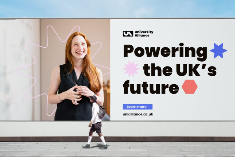
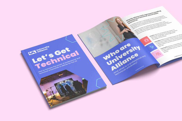
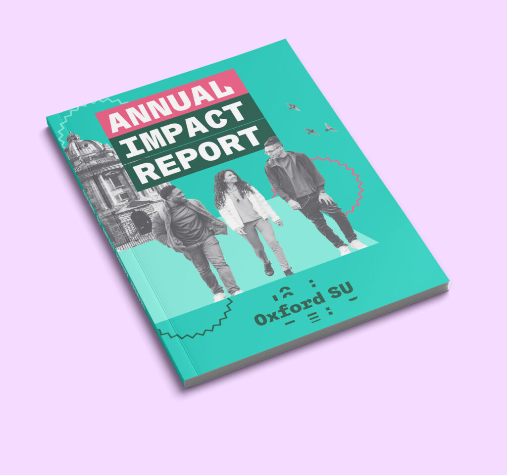
Through research, University Alliance found that their audience responded best to visuals featuring bold text and colours, and also showed a strong preference for images featuring people.
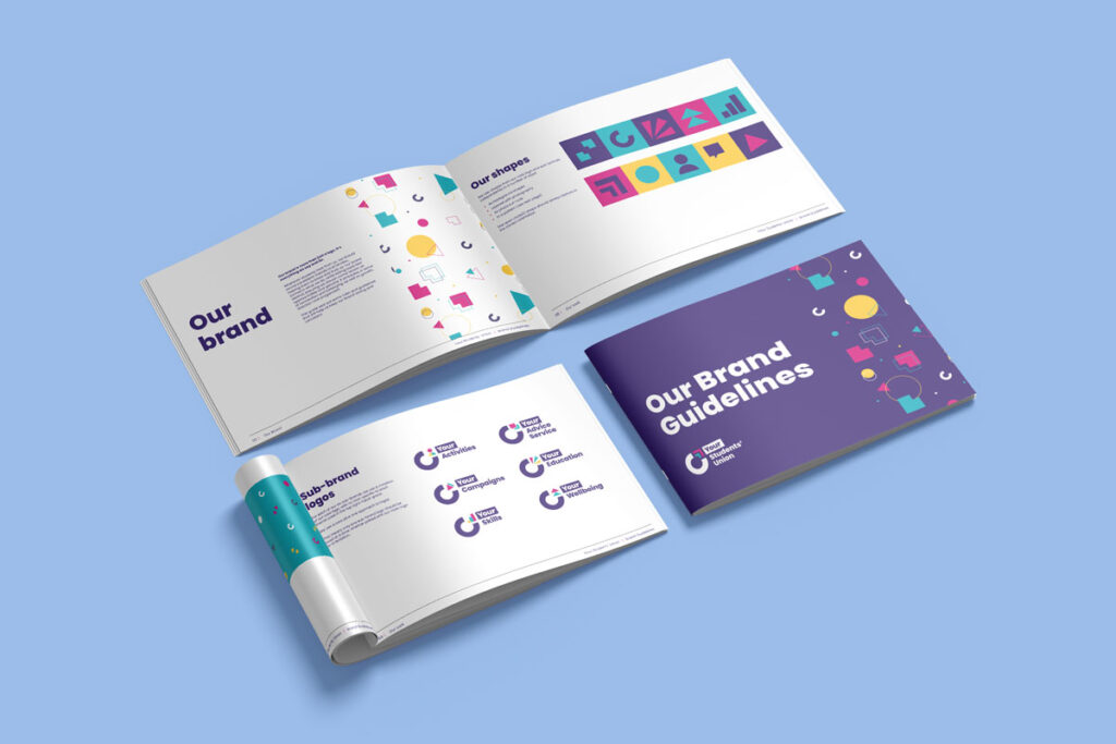
I created two visual routes to choose from, with logo design options, full brand guidelines, colours, fonts and more.
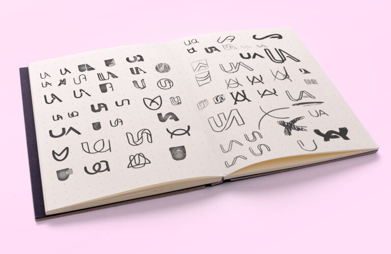
I enjoy sketching lots of logo ideas to get ideas flowing at the start of a project.
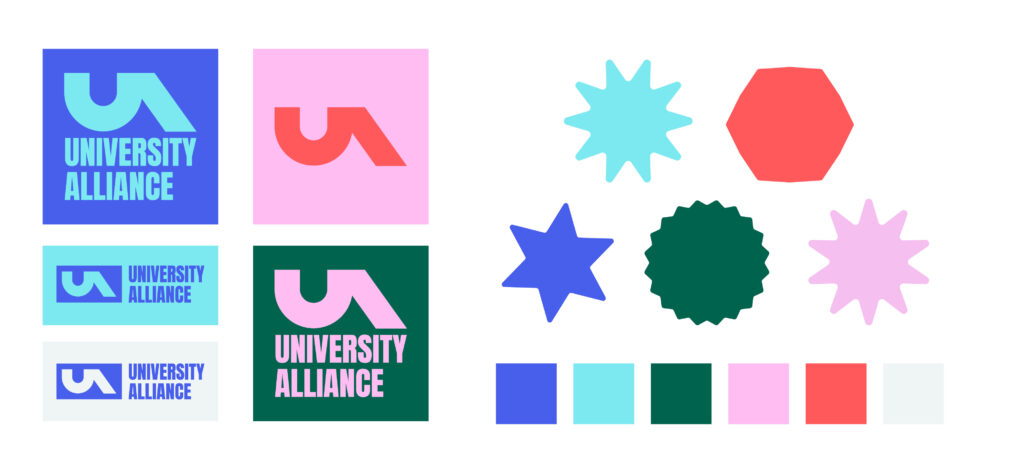
The first route I designed to convey a confident and modern look, through the use of high contrast, block colours, geometric shapes, and blocky fonts.
Evocative and bold, this route is also very flexible – and could be used for a range of audiences. For instance, the high contrast colours and funky brand shapes could be used in a student-facing campaign, while a more refined design featuring the dark blue hue and photography could be better suited for a serious campaign.
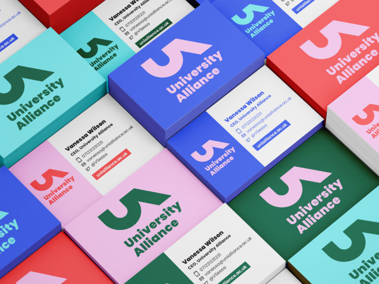
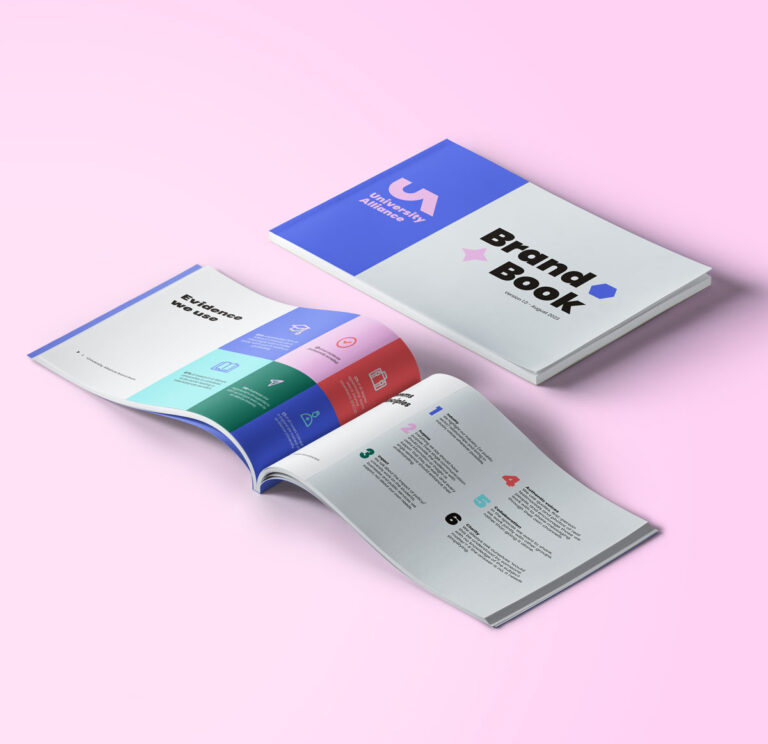
I reimagined the existing logo, offering both vertical and horizontal versions, that can be seamlessly integrated across different collateral.
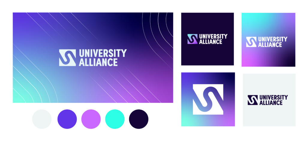
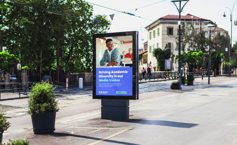
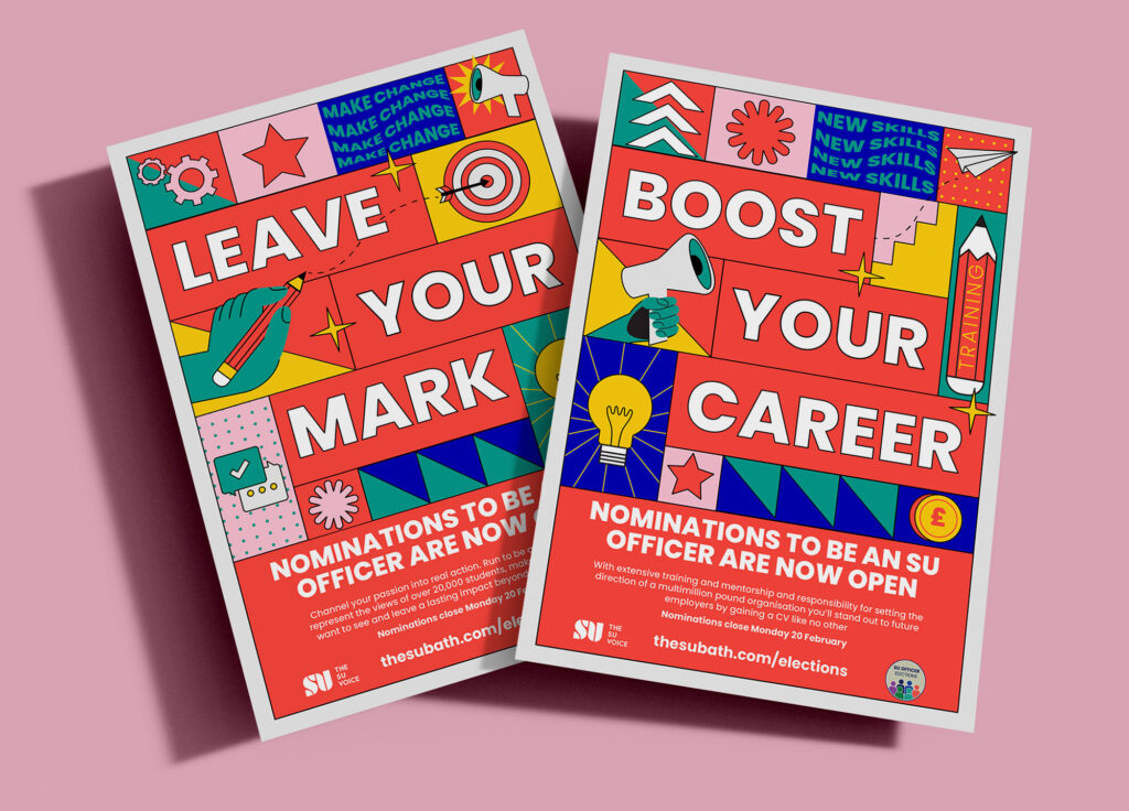
The second route aimed to portray a modern and dyamic look, which was engaging and tied into the brand values and persona of University Alliance.
I visualized this through the use of bold colours and gradients, which added vibrancy and energy to the designs.
The updated logo, while cleaner and more modern, still maintained recognisability with the existing brand. The icon combined the letters A and U to emphasise the organisation’s name, ‘Alliance,’ representing unity and collaboration.
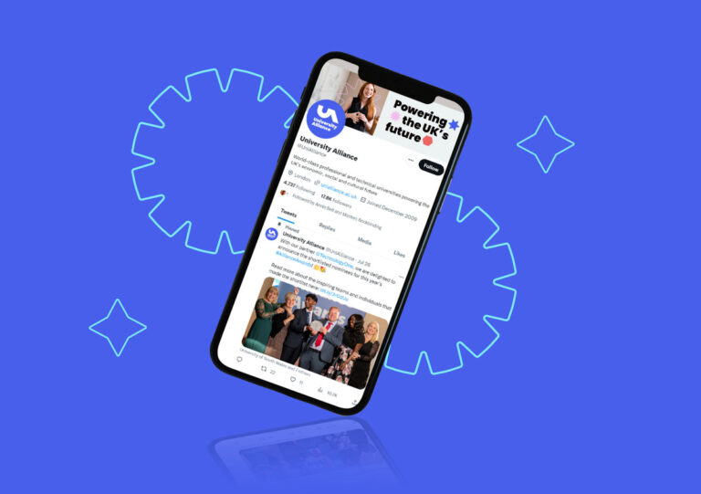
The first route was chosen for development, as the bold and creative look helped portray the brand persona best.
The branding was refined, with feedback from the client – and changes made as the brand elements were tested out on different collateral. The font was changed for increased accessibility.
The rebrand was launched through the organisation’s manifesto, which was distributed at all major political party conferences in autumn 2023.
Hats off to Jessica Augarde who has done such a fabulous job transforming the UA brand.
Our new visual identity absolutely reflects our members' strengths - as bold, dynamic, forward-thinking and innovative institutions!
We couldn't be more happy - thank you Jess!
Feelinginspired?
Get in touch to chat about your upcoming branding projects and campaigns today!